CHOOSING A PHOTO REFERENCE
If you're using a photograph as a reference while you draw, it's usually best to have several different photographs from varying angles and with different light sources to choose from. Not only does this give you a wider selection of poses and lighting options, it also allows you to combine different elements from each photograph. For example, if you are satisfied with the lighting in one photograph but you're drawn to the facial expression in another, you can combine the best parts from each for your portrait.


If you're using a photograph as a reference while you draw, it's usually best to have several different photographs from varying angles and with different light sources to choose from. Not only does this give you a wider selection of poses and lighting options, it also allows you to combine different elements from each photograph. For example, if you are satisfied with the lighting in one photograph but you're drawn to the facial expression in another, you can combine the best parts from each for your portrait.
Finding the Best Pose In photo A, the subject's eyes are squinting just a tad too much. In photo B, the subject's pose seems stiff and stilted. But in photo C, his pose and expression are just right!
Step One After studying my selection of photographs, I choose the best one and use it as a reference to block in the outline of the face, the guidelines, and the features_
Step Two I compare my initial sketch with the photograph and make necessary adjustments, indicating the roundness of the bottoms of the earlobes with light circles. Next I draw the slightly protruding teeth
Step Three After erasing my guidelines, I use a 2B pencil to add details to the eyes and eyebrows, and I also shade the lips and cheeks. My photograph shows that the light source is coming from above, so I leave the lightest areas at the top of the head and create the darkest values on the bottom half of the face and neck.
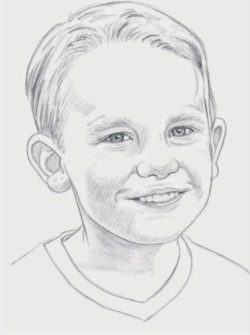
Step Four I darken the hair by firmly shading with a 2B. I continue evenly shading the face and the neck, then add a few light freckles with the ti p of my pencil. I darken the inside of the mouth to give the teeth form and add detail to the shirt by stroking on horizontal stripes and shading the neckband. Finally I compare my photograph with my drawing, making sure I've captured the likeness.
No comments:
Post a Comment