Sunday, 24 August 2014

ADULT BODY PROPORTIONS

ADULT BODY PROPORTIONS The proportional measurements of the parts of the human body vary slightly for every person, making them unique; paying attention to these variations will help you render accurate likenesses. But first it's important to understand how we're all the same by studying the average proportions of the human body, which are more apparent when we look at the skeletal and muscular views of the body. When drawing a figure, we measure in "heads," the vertical distance from the top of the head to the chin. Use rough measure meets to help place the parts of your figure. If a head or other body part appears too large or too small, you can check the body's proportions to correct the problem.


Skeletal Structure By studying bone structure, we can clearly see the relationship of the length of each part of the body to the whole. 


Body Musculature Proportion doesn't apply to length alone-the thickness of the body also must be proportionate. This aspect of proportion varies depending on the fitness of the individual, but the drawing above will help you assess these proportions based on an ideal human musculature. 


Male Proportions The average male is approximately 7-1/2 heads high; of course, these proportions vary with different body types. Often artists use an 8-head-high figure for the male as an ideal proportion. 


Female Proportions The average female is about half a head shorter than the male, or 7 heads high. Artists often elongate the female figure, especially in fashion drawings. Generally the female has narrower shoulders and a smaller waist than a male, but proportionally wider hips. 


UNDERSTANDING BODY ANATOMY

UNDERSTANDING BODY ANATOMY Figure drawing is easier when you have an understanding of the basic structure of the body. The muscles and bones give the body three-dimensional form, with the muscles filling out the skeletal foundation. Together they give the figure correct proportion-the relationship of the individual body parts to one another and to the body as a whole. Knowing what is beneath the skin of the figure will make your drawings more realistic and true to the form of your subject.


Muscles Affect Form The musculature of different individuals can vary depending on their level of physical fitness, but we all have the same muscles underneath. Therefore the general pattern of bumps and curves that make up the shape and form of a figure are very similar from person to person. It's a good idea to become familiar with the placement of the structures shown in the front view (above) and back view (below) so you can better envision the way the skin lays over the muscles to create the human form. 


Torso Musculature (Front) The torso muscles-from the neck to the shoulders, across the chest, down and around the rib cage, and then from the hips to the legs­ control the movement of the body and give form to the skeleton. Compare this with the drawing at top left.


Torso Musculature (Back) The muscles in the back of the torso generally extend across the body, rather than up and down as in the front. They hold the body erect, stretching tightly across the back when the limbs move forward. Compare this with the drawing at far left. 


Friday, 22 August 2014

UNDERSTANDING LIGHTING

UNDERSTANDING LIGHTING An important aspect of drawing-especially when drawing people-is lighting the subject. Lighting can have a dramatic effect on the figure's appearance, eliciting an emotional response from the viewer and setting the mood of the drawing. Subtle lighting often is associated with tranquility and can make a subject appear soft and smooth. This type of lighting tends to lighten the mood, generally lending a more cheerful feel to the composition. On the other hand, strong lighting makes it easier to see the contrasts between light and dark, which can add drama and make the subject appear more precisely formed. Longer shadows can mute the mood of a portrait, producing an air of pensiveness. Here strong shadows on the subject's face make her subtle smile seem reflective rather than content.


Step One First sketch the outlines of the figure on white drawing paper, using an HB pencil. Start with the torso, and then add the shape of the head. This is a three·quarter view of the body, but the face is in complete profile as the subject looks out the window. Block in the lines of the shoulders and chest; then add the window frame and sketch both arms. Draw the seat of the chair, and indicate the chair legs. Then add the subject's legs, with the sub- ject's right leg stretched out in front of her and the left leg pulled back toward the chair. Lightly sketch the entire back leg, "drawing through" the front leg to help position the leg correctly, and then erase any unnecessary lines. 


Step Two Switching to a B pencil, begin refining the head by adding the features and the hair, erasing unneeded lines as the drawing progresses. Refine the shirt and jeans, adding details like the seam along the leg. Add the back of the chair, and refine the shape of the rest of the chair. Draw the lower window frame, and refine her fingers and the shapes of the shoes. The main concern at this stage is establishing the overall shape of the figure-shading to indicate lighting and mood will come next. 


Step Three Using a very light touch, draw the edges of the shadows along the face, neck, arms, hands, and ankles. These lines will serve as a guide for adding the shading later. Also add this shading line to the shirt and pants, following your reference photo to outline areas where the lightest highlights will be, as this part of the paper will remain white. Begin to shade the hair, curving the strokes to follow its shape. Then shade the front of the chair. 


Step Four Shade the skin using light, diagonal strokes, except where the highlight is strongest. Erase any remaining shading guidelines. Then draw the stripes of the subject's shirt, following the folds and curves of the fabric over her form and leaving the lightest areas white. After adding details to the shoes, use a 2B pencil to create dramatic contrasts in value-shading the inside of the left leg, adding a few more dark values to the hair, and drawing the outlines of the shadows on the floor. look at your reference photo frequently to check the placement and strength of your highlights and dark values. Then apply additional shading to the back and legs of the chair, and shade the window frame.


Step Five Switch back to a very sharp B pencil to add some details to the face. Using a 2B pencil, create more dark values in the hair and shade the stripes on the shirt. Darken the rest of the jeans using strokes that follow the form of her legs. With a sharp pencil point, carefully add a layer of shading to the darker areas of the skin. Reflected light from the shirt lightens her jaw line. Reflected light also appears on her arms and fingers; stroke across the arms to give them form. Shade the rest of the chair, leaving white on the chair legs where the light hits them. Because this portrait utilizes strong contrasts in light, larger portions of the drawing will remain nearly white-including the highlights on her legs, her throat, and her chest. A portrait that comprises varying degrees of shadows without these large areas of highlight would lose drama and intensity. Next shade the shoes, making them darker where the woven pattern is more detailed. On the floor, use diagonal hatching strokes, angling away from the light to create the shadows cast by the legs of both the subject and the chair. 


Using Strong Natural Light The model for this drawing is sitting beside a f1oor-to-ceiling window. The sun is streaming through the glass from above and in front of her. The strong light creates visual interest by casting deep shadows and creating bright highlights.

Saturday, 2 August 2014

CHILDREN'S BODY PROPORTIONS

Drawing children can be challenging because you have to get their proportions just right or your drawings will look odd. Children's proportions are much different than adults', and children's proportions change as they age. For example, a baby's head is extremely large in proportion to its body-but as the child grows up, the head becomes smaller in proportion to the body. Additionally, a child's head is wider than it is long, so it's rounder than that of an adult. If your drawings of children look too old, make sure you're not using adult proportions!

Proportion Scale for Growth Years Infants' bodies are short, making their torsos and limbs appear proportionately thicker. As infants grow into toddlers, their faces and bodies begin to elongate. By age five, children are about half as tall as they will be as adults; and by age eight, growth spurts will add another 1 to 2 heads in height, further elongating the body. By the early teens, the face has elongated to such a degree that the eyes are almost at the center line of the face (where they are located on adults' faces); the change in proportion results in a less chubby look, thus we say bodies lose their "baby fat." People reach their full adult height between the ages of 18 and 20; musculature is still developing, but adult proportions have been achieved. Note: These proportions and observations are based on averages; carefully study your subjects to determine their individual proportions.


Toddler (3-3/4 heads tal/)


Age five (4- 1/2 heads tal/) 


Age eight (6 heads tal/) 


Young teen (6- 1/2 heads tal/)


Older teen (7 heads tal/)

TODDLERS' LIMBS


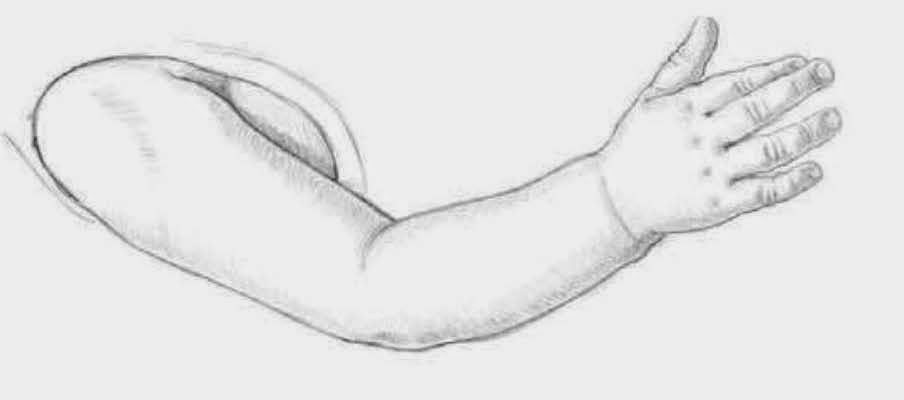
Arm and Hand The arm of a two-year-old usually is a bit pudgy and has wrinkles at the joints. Deep folds of skin at the inner elbow and wrist are fairly common, as are dimples on the elbow and knuckles.


Hand and Fingers The back of a toddler's hand is chubby and rounded. The fingers are plump and fleshy. even at the tips. 


Legs and Feet The legs are short. which makes them look fairly thick. Plump. two-year-old toes are short. round, and nearly shapeless_ The foot is just starting to form an arch at this stage.

BRIDAL PORTRAIT

BRIDAL PORTRAIT 
Special occasion photos, such as a bridal portrait, provide great references for drawing people. When drawing a bride, focus on capturing the key elements that symbolize the event, such as the veil, bouquet, and gown. The details of these objects are always unique to the particular subject, making it easy to achieve a likeness. Pay special attention to the way the gown and veil drape, the small details on the gown, the way the veil fits on the bride's head, and how her hair is styled. Finally, be sure to capture the glowing expression on her face!


Step One With an HB pencil, sketch in the shape of the figure. (Notice that this particular subject is only 6-1/2 heads tall.) Start with an oval for the head, and then block in the basic shapes of the veil, dress, and bouquet. Check the proportions before continuing. Make sure that the skirt of the gown is long enough in relation to the bodice and that you haven't made the head too small or too big in relation to the body. (You may find it easier to get the proportions right if you block in the subject's entire body first, then draw the clothing over it.) Once you're happy with the basic outlines, add guidelines for the facial features, curving them as necessary for the three-quarter view. 


Step Two Using the facial guidelines, place the eyes, eye­ brows, nose, mouth, and ear. The ear sits high on the head because the face is tilted down. Begin finding the location of the folds in the dress and veil, and sketch in placement lines. Remember that the way a fabric drapes depends on the thickness of the fabric as well as the form underneath it. Then block in the flower shapes inside the oval bouquet shape, and indicate the necklace with one line where it lays on her neck. 


Step Three Switch to a B pencil. Then shade the pullback hair, working from the hairline toward the crown and curving the strokes around the head. Be sure to leave the white highlight near the front of the head, as shown. Next lightly shade the dress and the veil to indicate the folds, always thinking about where the light is coming from. Be sure to leave strong highlights along the ridges of the veil to suggest the translucency of the filmy, white fabric. Shade the flowers in the bouquet, suggesting the shapes of the different types of flowers. Now refine the facial features, darkening the eyes and lips and creating the shape of the nose. Then begin to lightly shade the skin of the face, chest, and arm. It's important not to make the skin too dark; use a kneaded eraser to pull out some of the tone or create highlights as needed. 


Step Four Finally, refine the shading by adding more lay· ers of strokes where darker values are needed. Keep the shading smooth, applying the strokes very lightly and close together. Use a kneaded eraser to create some white edges on the veil To soften the shading and give the material a more realistic appearance, lightly use a tortilla on a few areas of the veil and dress. Add more shading to the flow· era, Using a 2B pencil in the darkest areas. Use the same pencil to further shade the hair, still leaving some white along the front for shine. Finish by using diagonal strokes with a 3B pencil to shade the background, which helps the white veil and dress stand out from the white paper.